
MCP Charts
Views and embed mode: two new ways to use MCP Charts
We’ve shipped two features requested by early adopters of our open-source MCP Charts package.
Views bring BI to your MCP server: you define a dashboard or a single chart once, and the agent renders it by name instead of writing SQL from scratch every time. The package adds two agent tools for this: explore_views lists what’s available, and render_view renders the one the agent picks.
The second feature, embed mode, renders the same charts inside your own web app, not just inside a chat client. Serve the widget from your own route, drop it in an iframe, and it renders chrome-less.
Views: a dashboard from one tool call
A view here is a real, named thing you author: a grid of KPI tiles, chart cells, and text blocks that renders as a dashboard. You write the queries and choose the layout. The agent picks which view to show, not what goes in it.
One addViews call gives your server two tools: one to list what’s published, one to render it by id.
import { addViews, chartCell } from "@bonnard/mcp-charts";
import { z } from "zod";

addViews(server, {
  views: [
    {
      id: "sales_overview",
      title: "Sales overview",
      kind: "dashboard",
      params: { region: z.enum(["EU", "US", "APAC"]).optional() },
      render: ({ region }) => ({
        columns: 2,
        items: [
          { type: "kpi", label: "Revenue", value: 336800, format: "currency" },
          chartCell(monthlyRows(region), { chartType: "line", title: "Revenue by month", span: 2 }),
          chartCell(regionRows(region), { chartType: "bar", title: "Revenue by region" }),
        ],
      }),
    },
  ],
});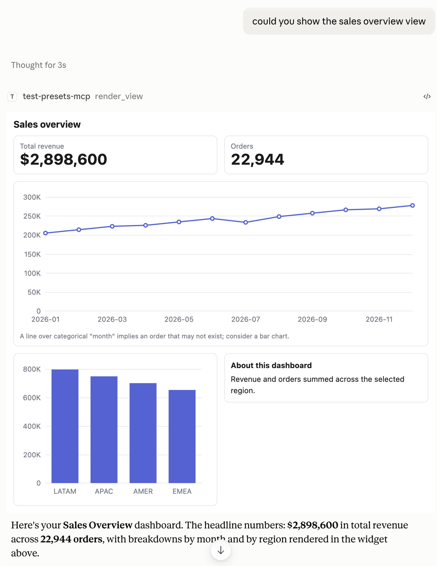
render_view call, one dashboard: KPI tiles, a line chart, a bar chart, and a text summary, rendered inside Claude.Views take typed parameters, so one dashboard serves every region instead of being rebuilt per filter. Need just one chart from it on its own? Give the cell an id and the agent can call that chart up directly, no extra tool required.
This is the difference between an agent that improvises a chart and an agent that shows your customers a number you already stand behind. The queries, the layout, and the wording are yours. The agent’s job is retrieval.
Full detail is in the named views guide and the dashboards reference. examples/dashboard is a runnable six-view server you can point a client at.
The same charts inside your own product
Most products that add an MCP server still have a web app, and that web app still needs charts. Embed mode lets one renderer serve both.
The package exports WIDGET_HTML, the same self-contained file the MCP resource serves. Serve it from your own route, point an iframe at it with an #embed fragment, and post it a spec. The widget drops its padding, cell borders, and title, so your card provides the chrome.
import { WIDGET_HTML } from "@bonnard/mcp-charts";

app.get("/chart-widget", (_req, res) => res.type("html").send(WIDGET_HTML));<div class="my-card">
<iframe id="rev" src="/chart-widget#embed" sandbox="allow-scripts"></iframe>
</div>Wait for the widget’s ready message, post it a ChartSpec, a single dashboard cell, or a whole dashboard with the cell you want addressed by id. It reports back what height it needs when the content has one, which KPI, text, and table cells do and charts do not.
sandbox="allow-scripts" is all the widget needs. It makes no network requests of its own, every payload string is escaped before it reaches the DOM, and it only accepts messages from its own parent window. Theming goes through a small set of validated tokens rather than CSS overrides, so a caller cannot inject a stylesheet into the frame. Charts follow a light or dark theme; the tokens cover the HTML surface around them.
The flags, the message shapes, the token grammar, and the stability contract are in the embed mode guide, with a runnable two-card page in examples/embed.
Smaller changes in the same releases
Bar charts stay vertical unless you ask for horizontal: true. The resolver used to flip any categorical bar chart with more than eight rows, which sent a twelve-month series sideways. Row count was standing in for label width, and it was bad at it.
Text tiles render markdown, so bold, links, lists, and headings in a summary come out formatted instead of as literal syntax. Raw HTML never passes through, which keeps it safe for model-written or user-typed text.
Table tiles scroll inside their cell with a sticky header instead of growing the card without limit, and a short cell no longer stretches to match a taller chart beside it.
Getting started
Add it to an existing MCP server with npm install @bonnard/mcp-charts, then start here. The source is on GitHub. Bonnard never connects to your database: you pass a callback, and we render the rows it returns.